Each Friday, I take one of the entries from my old Super Posts and expand it into its own featured article.
This week: Mystique's movie design!
It can't be understated how big the first X-Men movie was in 2000. Avengers: Endgame becoming the top-grossing movie of all time can be traced directly back to the success of this movie. It was certainly the most important Marvel adaptation at the time, and Marvel - generally not one to have major canon immigrants at the time - bent over backwards to make the comics better reflect the movies.
As I'm sure you know, X-Men was much different from the comics of the time. The team was smaller and wore black leather. Xavier's was an actual school. The Brotherhood was made of some of the team's biggest villains (and Toad), and nearly all of them had a less human appearance than normal. The changes go on and on. Mystique in particular was naked with small spikes all over her skin. The rationale for her nakedness was that, if she morphed clothes, she'd be naked regardless (although let's be honest: they just wanted Rebecca Romijn to be naked); the textured skin was never explained.
But that's not how Mystique appeared in the comics. From her first appearance in Ms. Marvel #18 (April 1978), she's had more or less the same iconic look.
In 2001, Marvel started publishing a miniseries called X-Men Forever, ostensibly to build on the success of Avengers Forever. Like that series, this one would travel through the X-Men's history, but that's where the similarities end. While Avengers Forever's ultimate goal was to explain away some continuity bugs, the goal of X-Men Forever was simply to make the X-Men more like the comics. And that is how, in issue 6 (April 2001), Mystique came to look like this:
To say the change didn't last would be putting it lightly. It might as well have not happened at all. Her next published appearance that wasn't a flashback or morphed was a year later in Uncanny X-Men #404 (April 2002). She looks normal.
In fact, the only other appearance I can find of Mystique's movie form is in X-Treme X-Men #32 (October 2003), when a mutant named Revenant make Rogue think she's turning into Mystique.
And that's not even really Mystique. But that's for the best, because it's not a great design. I think the movies have realized that too, because over time, her skin has gotten smoother and smoother and she's started wearing clothes even when unmorphed.
Subheader
A forever in-work compendium of Marvel and DC canon immigrants. What's a canon immigrant? Go here to find out!
Showing posts with label Marvel Appearances. Show all posts
Friday, November 22, 2019
Wednesday, October 9, 2019
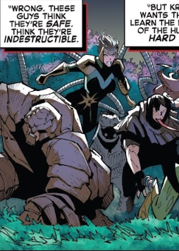
Appearance Spotlight: Lady Octopus
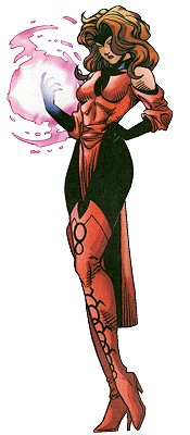
There's a strange phenomenon that happens as part of being a comics fan: the characters and concepts you're introduced to in your first couple years of reading comics become far more important in your mind than they are in the grand scheme of the universe. It's certainly true of me. It's why the Slingers are one of my favorite superteams, it's why I'm still disappointed Conduit never appeared in Smallville, and it's why my favorite Scarlet Witch outfit will always be this one. It's also why I'm glad Lady Octopus is having a resurgence.
Lady Octopus, or Doctor Octopus as she was originally called, was a former student of the original Doctor Octopus, who took over the role when he died. She first appeared in Amazing Spider-Man #406 (August 1995), and as that story is not only in the mid-90s, but in the Clone Saga as well, her story is needlessly complicated. I won't get into it all here, but suffice to say, it involves blending reality and virtual reality. Again, mid-90s.
After the original Doc Ock returned, she started going by Lady Octopus and only made sporadic appearances here and there. Recently she had a cameo in Amazing Spider-Man #17 (March 2019), though not wearing either her classic costume or her current one...
...which is strange, because in the next issue - Amazing Spider-Man #20 (April 2019) - she IS wearing an updated version of her classic outfit. Looking at the two, it seems like the one above is simply a coloring error, but I don't know that for sure.
A few months later, though, she appears in a brand new costume with the new Sinister Syndicate in Amazing Spider-Man #25 (July 2019).
What's the deal? Well, only a few months earlier - December 2018 - a movie called Spider-Man: Into the Spider-Verse was released. And one of the many villains who appeared in that movie was a female Doctor Octopus. To be clear, she is not Carolyn Trainer. She's Olivia Octavius, the CEO of Alchemax. She looks like this.
Clearly it's not an exact match. But side-by-side, it's easy to spot the similarities. The long, pulled-up brown hair instead of the short brown, black, or pink hair. The green, round goggles. The cream chestpiece. The green abdomen. The black arms and legs, and the lighter colored...thigh-highs, for lack of a better word.
One thing I wish they would've adapted was Olivia's clear, more lifelike tentacles, which would have made her more distinct from the original Doc Ock. But either way, it's nice to see a great movie like Into the Spider-Verse already impacting the comics!
Lady Octopus, or Doctor Octopus as she was originally called, was a former student of the original Doctor Octopus, who took over the role when he died. She first appeared in Amazing Spider-Man #406 (August 1995), and as that story is not only in the mid-90s, but in the Clone Saga as well, her story is needlessly complicated. I won't get into it all here, but suffice to say, it involves blending reality and virtual reality. Again, mid-90s.
After the original Doc Ock returned, she started going by Lady Octopus and only made sporadic appearances here and there. Recently she had a cameo in Amazing Spider-Man #17 (March 2019), though not wearing either her classic costume or her current one...
...which is strange, because in the next issue - Amazing Spider-Man #20 (April 2019) - she IS wearing an updated version of her classic outfit. Looking at the two, it seems like the one above is simply a coloring error, but I don't know that for sure.
A few months later, though, she appears in a brand new costume with the new Sinister Syndicate in Amazing Spider-Man #25 (July 2019).
What's the deal? Well, only a few months earlier - December 2018 - a movie called Spider-Man: Into the Spider-Verse was released. And one of the many villains who appeared in that movie was a female Doctor Octopus. To be clear, she is not Carolyn Trainer. She's Olivia Octavius, the CEO of Alchemax. She looks like this.
Clearly it's not an exact match. But side-by-side, it's easy to spot the similarities. The long, pulled-up brown hair instead of the short brown, black, or pink hair. The green, round goggles. The cream chestpiece. The green abdomen. The black arms and legs, and the lighter colored...thigh-highs, for lack of a better word.
One thing I wish they would've adapted was Olivia's clear, more lifelike tentacles, which would have made her more distinct from the original Doc Ock. But either way, it's nice to see a great movie like Into the Spider-Verse already impacting the comics!
Wednesday, September 11, 2019
Appearance Spotlight: Killmonger
Black Panther's Killmonger is easily among the best Marvel Cinematic Universe villains, due to a combination of a sympathetic backstory and goal and being played by the charismatic Michael B. Jordan.
In the comics, Killmonger's backstory is pretty much the same although his goal is exactly the opposite (making Wakanda even more isolationist rather than sharing its technology with the world), but another important difference is their appearance. While the movie's Killmonger where's a leopard-inspired take on Black Panther's armor...
...the comics version of Killmonger goes for more a gladiator-esque look.
And that's still true today, for this Killmonger. But it's not true for another Killmonger. See, in Black Panther volume 7 by Ta-Nehisi Coates establishes an "Intergalactic Empire of Wakanda" that's some combination of in another reality and 2000 years in the future. I'm a little unclear based on what I could find online. Regardless, many of the people in this storyline share their names with Wakandans we know, including Emperor N'Jadaka, who's named after Killmonger. And his armor looks like this:
Note that it's not an exact recreation, and the MCU's Killmonger certainly doesn't have a cape made from a Symbiote, but it's still close enough that it's easy to tell what they were going for.
In the comics, Killmonger's backstory is pretty much the same although his goal is exactly the opposite (making Wakanda even more isolationist rather than sharing its technology with the world), but another important difference is their appearance. While the movie's Killmonger where's a leopard-inspired take on Black Panther's armor...
...the comics version of Killmonger goes for more a gladiator-esque look.
And that's still true today, for this Killmonger. But it's not true for another Killmonger. See, in Black Panther volume 7 by Ta-Nehisi Coates establishes an "Intergalactic Empire of Wakanda" that's some combination of in another reality and 2000 years in the future. I'm a little unclear based on what I could find online. Regardless, many of the people in this storyline share their names with Wakandans we know, including Emperor N'Jadaka, who's named after Killmonger. And his armor looks like this:
Note that it's not an exact recreation, and the MCU's Killmonger certainly doesn't have a cape made from a Symbiote, but it's still close enough that it's easy to tell what they were going for.
Friday, August 30, 2019
Flashback Friday: Bullseye's Appearance
Each Friday, I take one of the entries from my old Super Posts and expand it into its own featured article.
This week: Bullseye's appearance!
Bullseye, the long-time Daredevil villain with perfect aim, has one of the best looks around, in my opinion.
But in the early 2000s, comic book adaptations had a strange relationship with comic book accuracy. Although they were looking to the comics for stories more than ever before, the character designs were generally more "realistic" and "down to Earth". That's why, in Daredevil (February 2003), Bullseye looks like this below. The strange thing is that he asks for a costume halfway through the movie, but still doesn't get one.
In the miniseries Daredevil/Bullseye: The Target #1 (September 2002), Bullseye starts wearing plainclothes to draw less attention to himself, but someone complains, so he draws a target on his forehead like so (below). Now I know what you're thinking: this came out almost half a year before the movie. What gives? Well, the movie design had been released by June 2002, so that gives plenty of time for both the fans and the comics creators to become familiar with it.
In Daredevil #48 (June 2003), we get an even more movie-accurate version. In the next issue, we learn it's a tattoo instead of a scar.
But then in Daredevil #49 (July 2003), Daredevil carves it into his head, meaning it will become a scar.
He was back in his classic outfit by Thunderbolts #110 (January 2007)...
...although interestingly, the ditching of his costume seemed to only happen in Daredevil. Whenever he appeared in miniseries during this time, such as Identity Disc (June 2004), Bullseye: Greatest Hits (September 2004), or Punisher vs. Bullseye (November 2005), he wore his classic outfit.
Presumably he still has the scar, but we never see it.
This week: Bullseye's appearance!
Bullseye, the long-time Daredevil villain with perfect aim, has one of the best looks around, in my opinion.
But in the early 2000s, comic book adaptations had a strange relationship with comic book accuracy. Although they were looking to the comics for stories more than ever before, the character designs were generally more "realistic" and "down to Earth". That's why, in Daredevil (February 2003), Bullseye looks like this below. The strange thing is that he asks for a costume halfway through the movie, but still doesn't get one.
In the miniseries Daredevil/Bullseye: The Target #1 (September 2002), Bullseye starts wearing plainclothes to draw less attention to himself, but someone complains, so he draws a target on his forehead like so (below). Now I know what you're thinking: this came out almost half a year before the movie. What gives? Well, the movie design had been released by June 2002, so that gives plenty of time for both the fans and the comics creators to become familiar with it.
In Daredevil #48 (June 2003), we get an even more movie-accurate version. In the next issue, we learn it's a tattoo instead of a scar.
But then in Daredevil #49 (July 2003), Daredevil carves it into his head, meaning it will become a scar.
He was back in his classic outfit by Thunderbolts #110 (January 2007)...
...although interestingly, the ditching of his costume seemed to only happen in Daredevil. Whenever he appeared in miniseries during this time, such as Identity Disc (June 2004), Bullseye: Greatest Hits (September 2004), or Punisher vs. Bullseye (November 2005), he wore his classic outfit.
Presumably he still has the scar, but we never see it.
Wednesday, August 14, 2019
Costume Spotlight: Captain America's Armory
In Captain America #12 (July 2019), we learn that Captain America has an armory of sorts. We've seen this with characters like Iron Man and Batman, but it's a first for good ol' Captain Rogers. In doing so, however, we're treated to a variety of costumes from throughout his history, including a few I wouldn't exactly expect to see.
On the far left is, naturally, the costume from his first appearance in Captain America Comics #1 (1939). But more intriguing is the one next to it. This one isn't from the comics at all, but instead, the 1979 tv movie, and its sequel, Captain America II: Death Too Soon (also 1979).
These movies featured a very different Captain America more inspired by Evel Knievel. There was still a tie to the 40s, though it was because Steve Rogers's father was a famous government agent of the time, also known as Captain America. And there was still a super-soldier serum, though it was more of a super-steroid derived called FLAG (Full Latent Ability Gain) from Steve's father's own physiology. Everything else about the story is different.
The suit after that is the Commander Rogers outfit from circa 2010, but the next two are VERY interesting. The first is Captain America's World War II uniform from The Ultimates #1 (January 2002)...
...and the next is his modern outfit from the same issue. Which means they're from Ultimate Marvel, an entirely different comics universe. What's going on here? Are they relics from the merging of Earth-1610 and Earth-616 in Secret Wars? Or is there some other explanation?
Finally, there's this one. I can't totally be sure it belongs on this site, but I'm including it to put it to the masses. It looks like it's probably from some animated project, but I can't figure out which one. So what say you? Is this suit from some tv or movie, maybe a toy line or Hostess ad? Is it from some comics alternate reality? Or is it just from some run-of-the-mill comics storyline and I simply don't recognize it?
Let me know if you know!
On the far left is, naturally, the costume from his first appearance in Captain America Comics #1 (1939). But more intriguing is the one next to it. This one isn't from the comics at all, but instead, the 1979 tv movie, and its sequel, Captain America II: Death Too Soon (also 1979).
These movies featured a very different Captain America more inspired by Evel Knievel. There was still a tie to the 40s, though it was because Steve Rogers's father was a famous government agent of the time, also known as Captain America. And there was still a super-soldier serum, though it was more of a super-steroid derived called FLAG (Full Latent Ability Gain) from Steve's father's own physiology. Everything else about the story is different.
The suit after that is the Commander Rogers outfit from circa 2010, but the next two are VERY interesting. The first is Captain America's World War II uniform from The Ultimates #1 (January 2002)...
...and the next is his modern outfit from the same issue. Which means they're from Ultimate Marvel, an entirely different comics universe. What's going on here? Are they relics from the merging of Earth-1610 and Earth-616 in Secret Wars? Or is there some other explanation?
Finally, there's this one. I can't totally be sure it belongs on this site, but I'm including it to put it to the masses. It looks like it's probably from some animated project, but I can't figure out which one. So what say you? Is this suit from some tv or movie, maybe a toy line or Hostess ad? Is it from some comics alternate reality? Or is it just from some run-of-the-mill comics storyline and I simply don't recognize it?
Let me know if you know!
Wednesday, July 24, 2019
Character Spotlight: Howard the Duck on Film (a 2-for-1!)
In SHIELD #10 (September 2015), guest star Howard the Duck has to deal with a cosmic entity called The Liverer, whose goal is to eat a cosmic pate made from the livers of one million Howard the Ducks. His torso has a portal through which you can see alternate worlds, and Howard the Duck enters it, causing him to see alternate Howard the Ducks.
Among the many versions of himself he sees, including Howard the Human, Spider-Howard, and Indiana Howard, he sees the two film versions of himself!
The scruffy-looking one is the MCU version of Howard. He first appeared in Guardians of the Galaxy (2014), and then later, Guardians of the Galaxy vol. 2 (2017) and Avengers: Endgame (2019).
The one with the guitar is the Howard that starred in Howard the Duck (1986), Marvel's first theatrical film.
I admit these aren't true examples because they are still presented as alternate realities, but if Spider-Verse counts, so do these!
Among the many versions of himself he sees, including Howard the Human, Spider-Howard, and Indiana Howard, he sees the two film versions of himself!
The scruffy-looking one is the MCU version of Howard. He first appeared in Guardians of the Galaxy (2014), and then later, Guardians of the Galaxy vol. 2 (2017) and Avengers: Endgame (2019).
The one with the guitar is the Howard that starred in Howard the Duck (1986), Marvel's first theatrical film.
I admit these aren't true examples because they are still presented as alternate realities, but if Spider-Verse counts, so do these!
Wednesday, July 10, 2019
Nebula's Appearance
Sometimes, in comic book adaptations, a detail can be based on something that's already extant in the comics, but changed ever so slightly for the new medium. When it comes to designs, this usually means making the design more intricate. Of course, because canon immigration is essentially inescapable, then the more intricate design finds its way into the comics. This is what happened with Nebula.
Sometimes when this happens, it takes me a while to learn it happened. This is also what happened with Nebula.
When Nebula first appeared in The Avengers #257 (May 1985), she was a pirate who had seized control of Thanos's ship, the Sanctuary II, in a period when he was presumed dead. She claimed to be his granddaughter, and she looked like this:
In Silver Surfer #69 (June 1992), she's catatonic, so one of the people looking after her takes her to Dr. Mandibus to get her back to normal. In Silver Surfer #72 (July 1992), we see that Dr. Mandibus was able to restore her mental capacity, but turned her into a cyborg to do so.
She shows up again in Silver Surfer #110 (September 1995), and she mostly looks the same except she's grown her hair out again.
In Nova #1 (March 1999), however, she's back to her original look.
But in her next appearance, Annihilation: Ronan #1 (April 2006), she's back to being a bald cyborg. She continues to look this way through the rest of the Annihilation event.
The modern Guardians of the Galaxy spun out of the Annihilation event, so it's no surprise that, when Guardians of the Galaxy was released in 2014, Nebula's look was based on how she appeared in Annihilation. Overall it's simply a more detailed version of the look above. The most major change is the stripe down the middle of her face, which I believe is meant to mimic the stripe down her chest that's present in most of the images above.
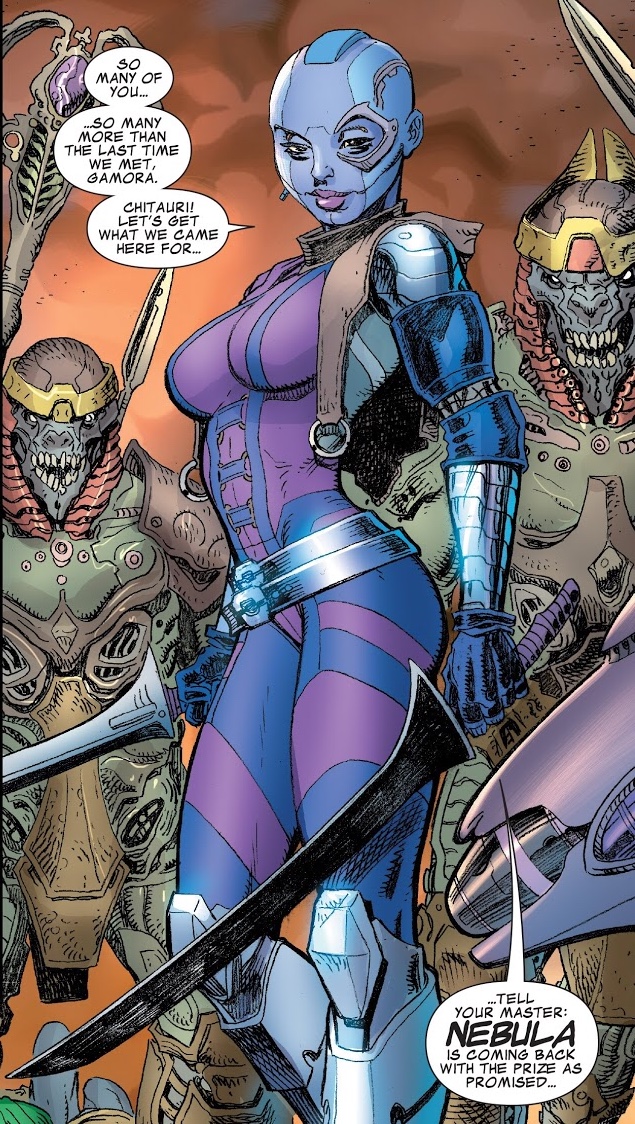
Guardians of the Galaxy was a huge hit, so it's no surprise that, when she appeared in Guardians Team-Up #1 (March 2015) - itself a book that wouldn't exist without the movie - she appeared as she does in the movie. Notably, she's flanked by Chitauri, another case of appearance canon immigration.
And she's appeared that way ever since!
That's not the only change to Nebula the movie made, but we'll get to that next week.
Sometimes when this happens, it takes me a while to learn it happened. This is also what happened with Nebula.
When Nebula first appeared in The Avengers #257 (May 1985), she was a pirate who had seized control of Thanos's ship, the Sanctuary II, in a period when he was presumed dead. She claimed to be his granddaughter, and she looked like this:
In Silver Surfer #69 (June 1992), she's catatonic, so one of the people looking after her takes her to Dr. Mandibus to get her back to normal. In Silver Surfer #72 (July 1992), we see that Dr. Mandibus was able to restore her mental capacity, but turned her into a cyborg to do so.
She shows up again in Silver Surfer #110 (September 1995), and she mostly looks the same except she's grown her hair out again.
In Nova #1 (March 1999), however, she's back to her original look.
But in her next appearance, Annihilation: Ronan #1 (April 2006), she's back to being a bald cyborg. She continues to look this way through the rest of the Annihilation event.
The modern Guardians of the Galaxy spun out of the Annihilation event, so it's no surprise that, when Guardians of the Galaxy was released in 2014, Nebula's look was based on how she appeared in Annihilation. Overall it's simply a more detailed version of the look above. The most major change is the stripe down the middle of her face, which I believe is meant to mimic the stripe down her chest that's present in most of the images above.
Guardians of the Galaxy was a huge hit, so it's no surprise that, when she appeared in Guardians Team-Up #1 (March 2015) - itself a book that wouldn't exist without the movie - she appeared as she does in the movie. Notably, she's flanked by Chitauri, another case of appearance canon immigration.
And she's appeared that way ever since!
That's not the only change to Nebula the movie made, but we'll get to that next week.
Friday, May 24, 2019
Flashback Friday: Spidey's "Spider-Man Unlimited" Costume
Each Friday, I take one of the entries from my old Super Posts and expand it into its own featured article.
This week: Spider-Man's Spider-Man Unlimited Costume!
In 1999, Fox Kids released an animated series called Spider-Man Unlimited, that had the strange premise of sending Spider-Man to Counter-Earth - a planet in the same orbit as Earth on the opposite side of the Sun created by the High Evolutionary, obvi - along with Venom and Carnage, and giving him a new, hi-tech suit. Partly this was to cash in on the success of the recent hit Batman Beyond, but it was also because a little movie you may have heard of called Spider-Man was in production, meaning Fox Kids and Saban Entertainment had to somehow make a Spider-Man cartoon without access to any of the classic parts of the Spider-Man franchise, including his costume. Which, as I'm sure you know, looks like this.
But in Spider-Man Unlimited, he looks like this.
Spider-Man Unlimited premiered in October 1999. The following month, Webspinners: Tales of Spider-Man #13 (November 1999) was released with the following cover:
In the story itself, you discover that Spider-Man receives visions of characters from the Spider-Man Unlimited world, and then enters the Negative Zone, where his suit changes - for absolutely no reason - into the Unlimited costume. It's back to normal by the end of the next issue. As you can see from the footnote, this was just a way to promote the show and the tie-in series that was debuting the same month this issue came out.
Later, during Spider-Verse, we'd see this costume again. The Spider-Verse creators considered Spider-Man Unlimited and Spider-Man: The Animated Series to be the same reality, although that was not the show's intentions.
This week: Spider-Man's Spider-Man Unlimited Costume!
In 1999, Fox Kids released an animated series called Spider-Man Unlimited, that had the strange premise of sending Spider-Man to Counter-Earth - a planet in the same orbit as Earth on the opposite side of the Sun created by the High Evolutionary, obvi - along with Venom and Carnage, and giving him a new, hi-tech suit. Partly this was to cash in on the success of the recent hit Batman Beyond, but it was also because a little movie you may have heard of called Spider-Man was in production, meaning Fox Kids and Saban Entertainment had to somehow make a Spider-Man cartoon without access to any of the classic parts of the Spider-Man franchise, including his costume. Which, as I'm sure you know, looks like this.
But in Spider-Man Unlimited, he looks like this.
In the story itself, you discover that Spider-Man receives visions of characters from the Spider-Man Unlimited world, and then enters the Negative Zone, where his suit changes - for absolutely no reason - into the Unlimited costume. It's back to normal by the end of the next issue. As you can see from the footnote, this was just a way to promote the show and the tie-in series that was debuting the same month this issue came out.
Later, during Spider-Verse, we'd see this costume again. The Spider-Verse creators considered Spider-Man Unlimited and Spider-Man: The Animated Series to be the same reality, although that was not the show's intentions.
Friday, February 1, 2019
Flashback Friday: The Falcon's Animated Costume
Each Friday, I take one of the entries from my old Super Posts and expand it into its own featured article.
This week: The Falcon's animated costume!
The 90s were a bit of a golden age for animated series based on comic books. But that doesn't mean they were all good. For every Batman: The Animated Series, you had a Spider-Man: The Animated Series, and for every Spider-Man: The Animated Series, you had a Spider-Man Unlimited. And near the bottom of pretty much everyone's list is Avengers: United They Stand.
Avengers: United They Stand aired on Fox Kids in 1999. Even I could tell as a kid that it wasn't up to snuff. The animation was cheap, the stories weren't memorable, and it was the definition of "toyetic" (focusing design and story on how many toys you can make out of it), giving the Avengers entirely unnecessary battle armor to wear.
Another potential knock against it is that it didn't include "The Big Three": Iron Man, Captain America, and Thor. Iron Man is somewhat understandable because he had a show earlier in the decade so there may have been rights issues, but Cap and Thor? If anything was keeping them from the show, I'm not sure what it was, and considering they both guest-star near the end of the season, the creators probably just didn't want to use them. Now that's not necessarily a problem for me; I'm a huge fan of giving lesser-known characters the spotlight and letting them become well known characters. Heck, the MCU is built on that idea. But you have to have the stories to back it up, and this show didn't.
What does all this have to do with the Falcon? Well, even without taking the battle armor into account, nearly all of the Avengers got new designs. This is his classic comics appearance, although he's had several outfits along the same lines:
And this is how he looked on the show. Similar, but noticeably different. The Falcon appeared with this design in the first episode of the show, "Avengers Assemble, Part 1" (October 1999).
The costume made its debut in Captain America #25 (November 1999, a month after the debut of the show) and stuck around until at least Captain America #34 (August 2000). As the show's last new episode aired in February 2000, I can't imagine it lasted for much longer than that. Notice it's not exactly the same - all the blue parts are now red.
This outfit is the only one from the show - that I know of - to transfer to the comics, and I'm glad it did. I think it looks great, and it shows that, even though that art style itself wasn't that great, it doesn't means the actual designs weren't either.
This week: The Falcon's animated costume!
The 90s were a bit of a golden age for animated series based on comic books. But that doesn't mean they were all good. For every Batman: The Animated Series, you had a Spider-Man: The Animated Series, and for every Spider-Man: The Animated Series, you had a Spider-Man Unlimited. And near the bottom of pretty much everyone's list is Avengers: United They Stand.
Avengers: United They Stand aired on Fox Kids in 1999. Even I could tell as a kid that it wasn't up to snuff. The animation was cheap, the stories weren't memorable, and it was the definition of "toyetic" (focusing design and story on how many toys you can make out of it), giving the Avengers entirely unnecessary battle armor to wear.
Another potential knock against it is that it didn't include "The Big Three": Iron Man, Captain America, and Thor. Iron Man is somewhat understandable because he had a show earlier in the decade so there may have been rights issues, but Cap and Thor? If anything was keeping them from the show, I'm not sure what it was, and considering they both guest-star near the end of the season, the creators probably just didn't want to use them. Now that's not necessarily a problem for me; I'm a huge fan of giving lesser-known characters the spotlight and letting them become well known characters. Heck, the MCU is built on that idea. But you have to have the stories to back it up, and this show didn't.
What does all this have to do with the Falcon? Well, even without taking the battle armor into account, nearly all of the Avengers got new designs. This is his classic comics appearance, although he's had several outfits along the same lines:
And this is how he looked on the show. Similar, but noticeably different. The Falcon appeared with this design in the first episode of the show, "Avengers Assemble, Part 1" (October 1999).
The costume made its debut in Captain America #25 (November 1999, a month after the debut of the show) and stuck around until at least Captain America #34 (August 2000). As the show's last new episode aired in February 2000, I can't imagine it lasted for much longer than that. Notice it's not exactly the same - all the blue parts are now red.
This outfit is the only one from the show - that I know of - to transfer to the comics, and I'm glad it did. I think it looks great, and it shows that, even though that art style itself wasn't that great, it doesn't means the actual designs weren't either.
Wednesday, January 2, 2019
Appearance Spotlight: Killmonger’s Scars
I don't know if you've heard, but Black Panther - which came out all the way back in February 2018, almost a year ago - is a pretty big deal. It's the most successful MCU domestically, even beating all the Avengers films; it's the ninth most successful movie of all time worldwide (it doesn't beat the Avengers movies there); it's appearing on every "top 10 movies of 2018" list; it was nominated for a Best Picture Golden Globe; and most importantly, it was a cultural revolution.
So, of course, it elevated the status of all characters associated with it, turning them into household names. Not least among these was Killmonger, a character many call Marvel's best. It's no surprise, then, that Killmonger received a miniseries last month to delve into his origins, and it's even less of a surprise that this new story is influenced a bit by Black Panther.
When Killmonger first appeared in Jungle Action #6 (July 1973), he had a look similar to Kraven's in that it's like a tribal warrior look filtered through superhero comics.
He keeps that basic look throughout his history, though it becomes more involved and gains a mask.
But this style didn't carry through to the Black Panther movie. That movie got him looking straight like Vegeta. But it added a new detail, too: in keeping with the afro-futuristic design sense the movie went for, the Earth-199999 version of Killmonger had ritual scarring, one bump for each person he's killed.
On the first page of Killmonger #1 (December 2018), we see him with the same scarring:
The rest of the series is a flashback, so this is the only time we've seen it so far. But with three issues still to come, I imagine we'll see him get them at some point.
So, of course, it elevated the status of all characters associated with it, turning them into household names. Not least among these was Killmonger, a character many call Marvel's best. It's no surprise, then, that Killmonger received a miniseries last month to delve into his origins, and it's even less of a surprise that this new story is influenced a bit by Black Panther.
When Killmonger first appeared in Jungle Action #6 (July 1973), he had a look similar to Kraven's in that it's like a tribal warrior look filtered through superhero comics.
He keeps that basic look throughout his history, though it becomes more involved and gains a mask.
But this style didn't carry through to the Black Panther movie. That movie got him looking straight like Vegeta. But it added a new detail, too: in keeping with the afro-futuristic design sense the movie went for, the Earth-199999 version of Killmonger had ritual scarring, one bump for each person he's killed.
On the first page of Killmonger #1 (December 2018), we see him with the same scarring:
The rest of the series is a flashback, so this is the only time we've seen it so far. But with three issues still to come, I imagine we'll see him get them at some point.
Subscribe to:
Posts (Atom)